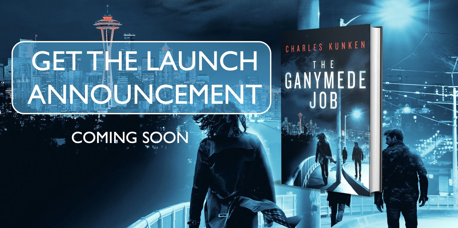
Which cover concept do you like better?
Silhouettes or No silhouettes??
A documentation about writing the ultimate heist novel. Get the full series here: charleskunken.com/hollywoodheistbacklot
My cover concept created by me using Procreate.
Today I've just got some quick thoughts on marketing.
Seth Godin says that marketing (at least my interpretation of it) is not something that happens after a product is complete, it is the practice of incorporating your people's needs into the product itself. It's different than simply 'advertising'.
I've taken a lot of time off from social media this summer because I've been focusing on the actual craft and creation of the novel. (My only consistent outreach is now the newsletter.) But by putting more energy towards trying to write a good book, I figure I'm working on marketing.
The way I see it there are two functions of marketing:
1. To let the user know what the product is.
2. To kick start word of mouth.
Marketing can either be an uphill battle of trying to 'get people to buy' a product or a downhill glide of getting people to try a product which they are then going to want to tell their friends about.
Seth also says that the best test of your product is to share it with 10 people and see if they go tell their friends without you asking. That's pretty profound and makes you definitely look in the mirror at yourself and ask - "would my product achieve that?"
When the product is sub par then sales are reliant on a consistent advertising spend to get people to try it once. But if the product is superior than the external 'marketing' (in the traditional sense) simply serves as creating the spark of awareness so that word can spread. Get the snowball rolling down hill. Easy to say. Very hard to do.
So, with the book I've thought , how would I try to sell it - market it - and does that actually sound compelling? Since the goal is to write something people are going to want to read, there's no sense in writing something that wouldn't sound very attractive to buy in the end,
Anyways, I started messing around with the cover.
To me the cover is part of the product. It sort of gives an overall emotion surrounding the acquisition and consumption of the story.
I'm trying to let the reader know what to expect while giving them what they're expecting, if that makes sense. My concept is to try and evoke 3 things:
1) something 'heisty'
2) something 'hollywood-y' and
3) something 'tech-ish'
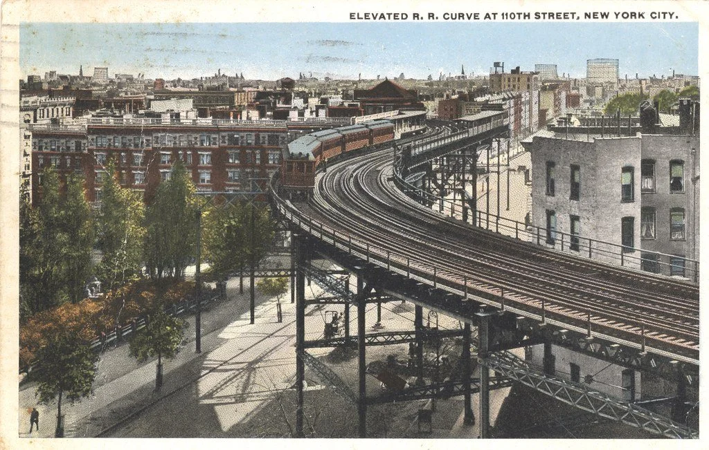
So the above is what I got so far. It actually originated as a google street view image that i've been running through filters and airbrushing on proceate. Here's what I started with:
I'm getting pretty nice on Procreate but I want to make sure it comes out looking pro, so I still have a lot of work to do. Item one, making sure the quad-copters look less like attack of the killer moths (cheers to my brother for some initial feedback).
Well, that's what we got this week my friends. If you have any feedback on the cover please let me know your thoughts. I definitely want to hear it.
Oh yea, I did want to ask, I also have a concept with Silhouettes in the foreground, which do you like better?
Silhouettes or no silhouettes??
LET ME KNOW!! :)
Have some thoughts? Feel free to drop a comment or hit me up: charlie@charleskunken.com







Please judge.